Early Examples of Data Visualization
Data visualization has been around much longer than you may initially think.
An argument can be made that the earliest forms of data visualization would be cave paintings from prehistoric times. Some of these paintings depicted animals with accurate scale as well as their seasonal migration patterns and methods of hunting them.
Other examples from historic periods would be economic data that was transcribed onto clay tablets in the ancient Sumerian, Egyptian, Minoan and Mycenean societies. There are surviving tablets are dated as far back as the early Bronze Age (3300 BCE), and they contain sophisticated transactional data that made use of tables much like modern spreadsheets.

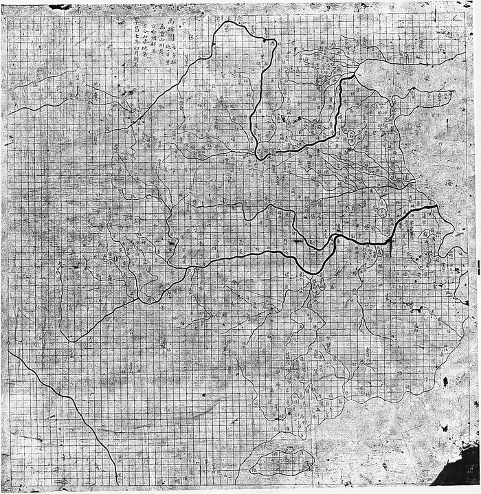
One of the best surviving records of data visualization that makes the use of accurate scaling is the Yu Ji Tu map, circa 1137 CE. This map was carved into stone and used grid squares representing one Chinese li (approximately 50 square km). The actual size of the carving is about 3 square feet, and the author is unknown.

Of course, cartography was an important profession and over the course of world history there have been thousands of maps drawn with an increasing accuracy to scale. The amount of information contained on maps has also increased over time, from just displaying geographical information such as natural land features like coastlines, rivers, etc. to the addition of things like wind patterns for sailing and scale of cities in proportion to their population and size.
An important shift came with the publications of William Playfair (1759–1823) who is considered to be the one of the inventors of modern graphical designs. Playfair was a Scottish political economist and published the first known time-series using economical data in his book, The Commercial and Political Atlas (London, 1786). This publication showed that the x and y axes on a chart could be used to quantify more abstract data than just distance, and thus the line graph was born. Playfair also published the first bar chart, pie chart, and circle graph, although these would take pages of text to explain to readers how to properly interpret them.

A longer summary of the history of data visualization can be read here.
